Good Mobile Website Design with Fully Responsive Websites from EzPagesPro
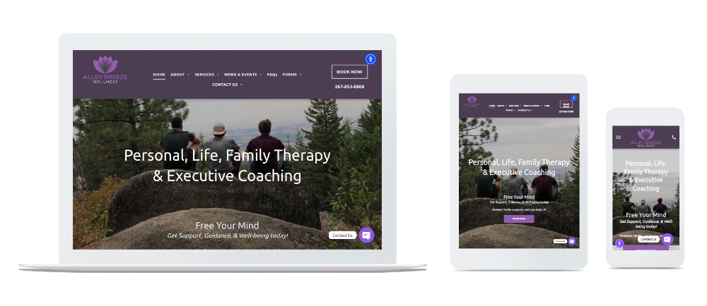
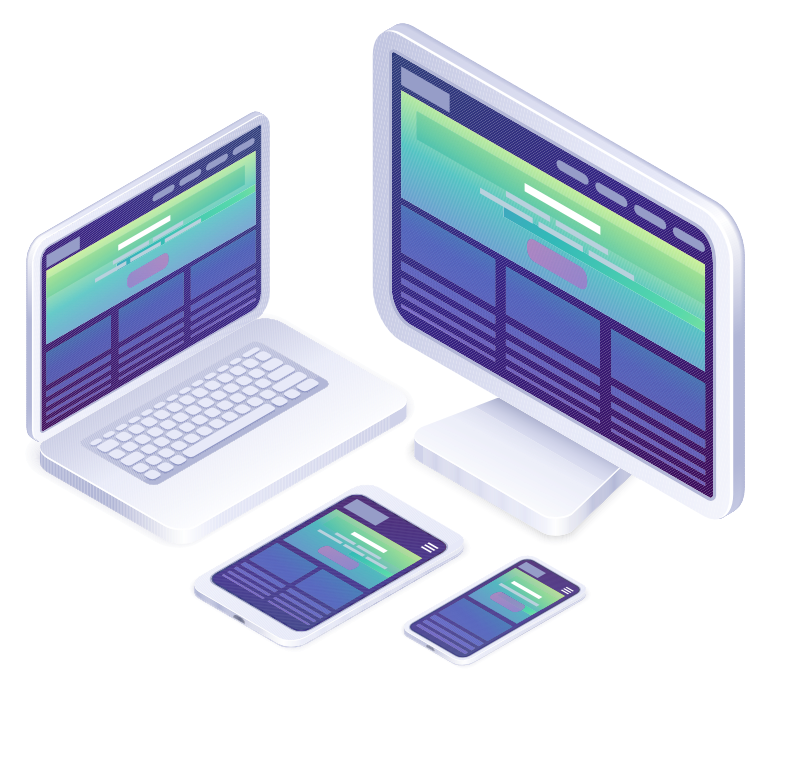
One Responsive Website That Works On Desktop, Tablet and Mobile
Revolutionize Your Website: Go Mobile-Friendly with EZPagesPro
In today's digital age, having desktop-only sites just won't cut it anymore. With nearly 50% of digital media time being spent on mobile devices, it's clear that websites need to adapt to be mobile-friendly, tablet-friendly, and desktop-friendly. This is where EZPagesPro comes in, offering responsive web design that ensures your site looks great on any device. Whether your customers are accessing your website on a smartphone, tablet, or computer, they'll have a seamless and visually appealing experience.
Beyond merely adapting to different screen sizes, responsive web design at EZPagesPro is about creating a dynamic and engaging user experience that evolves with new technologies and trends. It’s not just about looking good; it’s about being prepared for the future of digital interaction. As technology progresses, your website will continue to deliver exceptional experiences, thanks to our commitment to embracing new devices, resolutions, and technologies. This ongoing process ensures that every user, regardless of the device or platform they use, receives an optimal viewing experience tailored to their needs.
Your business deserves a responsive design that works for everyone, and that's exactly what EZPagesPro is dedicated to delivering. Every custom solution we create is designed to make your website as accessible and enjoyable for someone on an old laptop as it is for someone on the latest smartphone. Responsive Web design with EZPagesPro means investing in a future where your website continuously adapts and grows, providing a great custom experience for everyone, today and in the years to come.

Redefining Responsive Design: Tailored Features for Every Device
At EZPagesPro, we're dedicated to redefining responsive design by tailoring features specifically for different devices, ensuring an optimized user experience on every platform. This means going beyond just fitting screen sizes - for example, a Click-to-Call button appears on mobile websites, but not on tablet or desktop. We recognize that visitor experiences and needs can vary across devices, and we ensure that our website designs and content reflect that, adapting seamlessly to different browsing scenarios.
To achieve this, our team employs a variety of solutions to address the unique requirements of different browsers and devices. Each of our websites is equipped to dynamically adjust its elements, not just in size but also in functionality, without the need for specific browser dimensions. We invite you to experience the versatility of our responsive designs firsthand. Adjust your browser size or switch between devices as you explore our sites to see how effectively and smoothly our content and layouts transition, offering an ideal user experience regardless of how you choose to connect with us.
Crafting Captivating Websites: Elevate Your Online Presence with EZPages.Pro
At EZPages.Pro, our agency brings extensive web design expertise, creativity, and innovation to every website we create. With a deep commitment to perfecting our craft, we take pride in developing captivating layouts that not only capture visitors' attention but also drive the specific customer actions that matter most to you, ensuring that your online website presence stands out in today's competitive digital landscape. Our user-friendly platform and comprehensive agency support make it easy for small businesses and startups to update content, manage their online presence, and monitor analytics, setting us apart from other website agencies and providing you with the tools you need to succeed in the online marketplace.
We recognize that responsive web design is not just about making websites look good on any device — it's about preparing for the future right now. By understanding and implementing responsive design, we make your site not only adaptable to today’s variety of screen sizes but also ready for tomorrow’s emerging technologies. It's important to note that while responsive design greatly enhances user experience, it isn't the ultimate solution for every challenge posed by new devices and resolutions. As the digital landscape continues to evolve, so too must our strategies. At EZPagesPro, we commit to continuous learning and adaptation, ensuring that your website remains at the forefront of digital innovation, always delivering superior user experiences, regardless of how technology changes.

Is responsive web design the ultimate solution for adapting to the ever-changing mobile world?
In today's digital age, having desktop-only sites just won't cut it anymore. With nearly 50% of digital media time being spent on mobile devices, it's clear that websites need to adapt to be mobile-friendly, tablet-friendly, and desktop-friendly. This is where EZPagesPro comes in, offering responsive web design that ensures your site looks great on any device. Whether your customers are accessing your website on a smartphone, tablet, or computer, they'll have a seamless and visually appealing experience.
However, it's important to recognize that while responsive web design is a significant step forward, it is not the ultimate fix. The digital landscape is perpetually evolving, with new devices, platforms, and user expectations emerging regularly. At EZPagesPro, we understand that responsive design is an ongoing commitment, not a one-time solution. We continuously update and refine our design strategies to keep pace with technological advancements and ensure that your website not only looks great but also meets the ever-changing needs of your users.
Your business deserves a responsive design that works for everyone, and that's exactly what EZPagesPro is dedicated to delivering. Yet, we also remain vigilant, ready to adapt and innovate as new challenges arise in the mobile world, ensuring that your digital presence is as dynamic and resilient as the market itself.
How Responsive Web Design adaptS to user behavior and environment based on screen size, platform, and orientation
Responsive Web Design (RWD) dynamically adjusts the appearance of a website according to the specific device being used by the viewer. Here’s how it adapts seamlessly to different factors such as screen size, platform, and orientation:
Adapting to Screen Size
With flexible grids and layouts at its core, RWD allows content to reflow based on the screen size of the device. Whether you’re viewing a site on a tiny mobile screen or a large desktop monitor, the layout shifts to provide an optimal viewing experience. This means text is readable without zooming, and clickable elements are appropriately sized.
Adjusting to Platforms and Operating Systems
RWD accounts for the variances across platforms and operating devices by using CSS media queries. These queries enable the website to apply different styles depending on the device’s characteristics. For instance, a website might load lighter animations or fewer visual effects on a mobile device compared to a desktop, fostering faster load times and improved usability.
Orientation Changes
When a user switches from portrait to landscape mode on their device, a responsive website automatically rearranges its elements to suit the new orientation. The layout change is fluid, ensuring that usability is maintained regardless of how the device is held.
RWD also considers the broader settings on a user’s device, such an activated VPN or specific accessibility settings. This capability ensures that all users, regardless of their device’s settings, can access and navigate the site effectively.
By integrating these flexible and intelligent strategies, responsive web design ensures that a website is functional, accessible, and visually appealing across all devices and settings, eliminating the need to create multiple versions of a website for different devices. This dynamic adaptation significantly enhances user experience and engagement.
KEY DESIGN ADJUSTMENTS FOR SMALLER SCREENS
When browsing websites on smaller devices like smartphones or tablets, noticeable changes in the design are essential to enhance readability and usability. These modifications ensure that the site remains functional and aesthetically pleasing across different devices. Here are some common design changes you might observe:
Simplified Navigation
Navigation elements often undergo significant changes to accommodate the smaller display area. Menus might consolidate into fewer options or transform into a dropdown format, commonly known as a "hamburger menu", to save space and maintain ease of use.
Responsive Layouts
Websites adapt to various screen sizes by restructuring their layout. For example, a website might display content in multiple columns on a desktop but will stack these columns vertically on a smaller screen. This stacking helps in maintaining the flow of content and ensures that users do not miss any information.
Adaptation of Visual Elements
Visual elements such as images and logos are resized or repositioned based on the screen dimension:
Images can be scaled down to fit the width of the device, preventing horizontal scrolling that can detract from user experience.
Logos might simplify, moving to a more prominent position like the center top of the page, often just above the navigation, to maintain brand visibility.
Content Prioritization
To prevent clutter on smaller screens, non-essential content such as sidebars or decorative images often disappears or is moved to other sections like the bottom of the page. This prioritization helps in focusing the user's attention on the most crucial information first.
Increased Font Size and Button Spacing
Smaller screens require larger fonts to improve readability. Additionally, button sizes may increase, and the spacing between clickable elements is typically enhanced to accommodate touch interactions and prevent accidental taps.
Optimized White Space
While larger screens might feature generous white space to create a visually appealing layout, on smaller screens, this space is often reduced. This optimization helps in maximizing the use of space for critical content without overwhelming the user.
Each of these changes contributes to a smoother, more engaging mobile experience. Responsive design not only adjusts how content looks but also improves how it functions across different devices, ensuring that all users have a positive interaction with your website, no matter their screen size.
Fully Responsive Website FAQs
Related Blog Articles


Ready to Takeoff?
We will collaborate with you to develop a fully responsive website, optimizing for conversions.
EzPages.Pro designs, maintains and hosts websites that are tailored to all companies and startups, making it easy to update content, track analytics. EzPages offers comprehensive management services so you can focus on business growth.
Mailing Address: 1740 Dell Range Blvd, Ste H 13-60119, Cheyenne, WY, 82009