Website Design Trends for Small Businesses in 2024/2025
Staying ahead in the digital world means keeping up with the latest web design trends. For 2024 and 2025, the focus is on creating a seamless
user experience and a strong
online presence. Rapid tech advancements make it essential to adopt new standards to avoid falling behind.

Timeless principles like user-friendly navigation and data security remain crucial. However, emerging trends like Pantone’s Mocha Mousse color for 2025 and mobile-first design are shaping the future. Outdated designs can harm search rankings and user engagement, making it vital to stay updated.
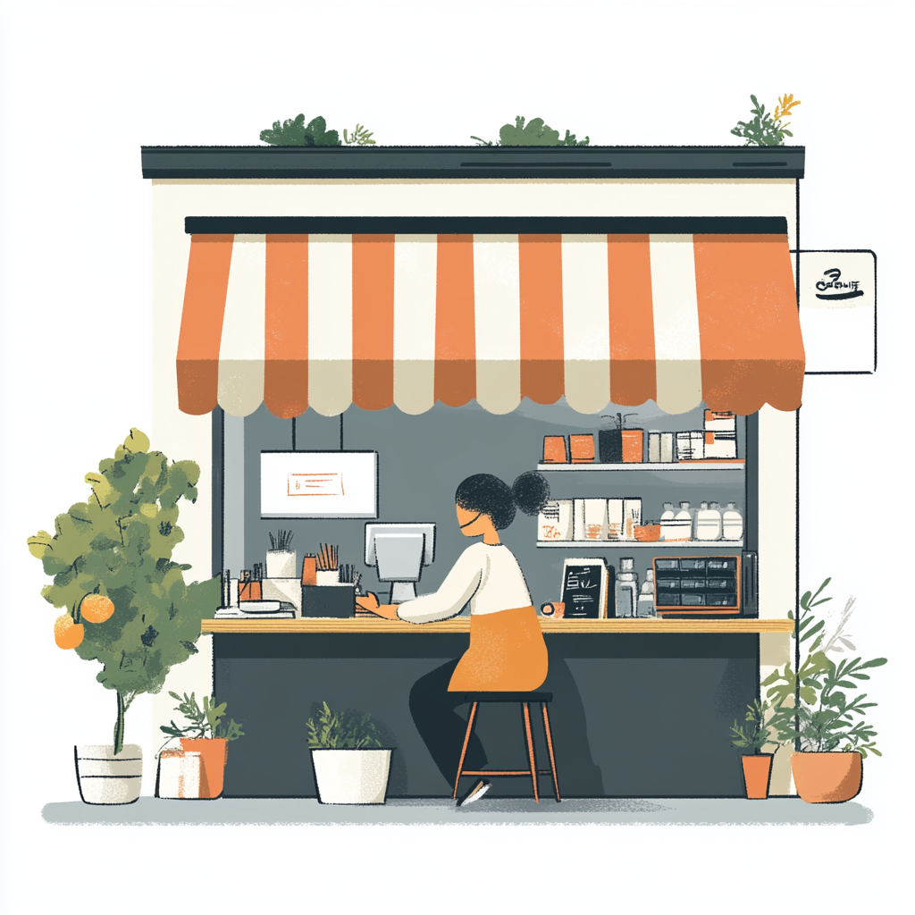
For startups, EZPages.Pro offers an affordable solution to build modern websites. Balancing aesthetics with technical performance ensures your site stands out. Sustainability is also a priority, both environmentally and in enhancing user experience.
Key Takeaways
- Adopt 2025 design trends to avoid losing conversions.
- Use EZPages.Pro for cost-effective, modern websites.
- Balance timeless principles with emerging trends.
- Incorporate Pantone’s Mocha Mousse for 2025 inspiration.
- Mobile-first design is essential for modern businesses.
- Outdated designs harm search rankings and user engagement.
- Sustainability enhances both environmental and user experience.
Why Staying Updated with Small Business Website Design Trends Matters
Modernizing your online presence ensures you stay competitive and relevant. With Google’s 2021 Page Experience Update prioritizing speed and user experience, a slow-loading site can drive visitors away. In fact, 53% of mobile users abandon pages that take more than three seconds to load.
Design directly impacts bounce rates. Sites that fail to meet the three-second threshold often lose potential customers. Modern design not only improves load times but also enhances SEO performance. Core Web Vitals, like Largest Contentful Paint (LCP) and Cumulative Layout Shift (CLS), are critical ranking factors.
Adopting the latest trends gives you a competitive edge in crowded markets. For example, Awwwards-recognized sites like Jeton.com set benchmarks for conversions. Their seamless user experience and responsive layouts ensure high engagement.
Outdated security protocols pose financial risks. Phamily Pharma’s innovative supply chain interface showcases how modern design can enhance functionality while ensuring safety. Similarly, Baseborn Studio’s minimalist approach proves that simplicity can drive results.
Mobile commerce is growing rapidly, making responsive
design essential. Consumers now expect interactive elements and intuitive navigation. Staying updated with these expectations ensures your site remains effective and engaging.
Embracing Soothing Color Palettes
Color plays a pivotal role in shaping user perceptions and emotions. In 2025, the shift from bold, saturated hues to nurturing palettes is transforming digital spaces. Multi-tonal schemes are gaining popularity, offering sophistication while reducing eye strain.
Take Apple.com, for example. Their use of negative space paired with muted tones creates a calming yet modern aesthetic. Similarly, Canva’s 2025 palette has improved user session duration by 15%, proving that thoughtful color choices enhance the user experience.
The Shift from Bold to Calm Colors
2024’s neon trends are giving way to earthy terracottas and sage greens in 2025. These colors evoke a sense of calm and connection, aligning with the growing preference for digital comfort. Here are some trending HEX codes for inspiration:
- Mocha Mousse: #9A7B4F
- Sage Green: #B2C8A0
- Earthy Terracotta: #CC6B4E
The adoption of Pantone’s Mocha Mousse is rooted in color psychology. This warm, neutral tone fosters trust and relaxation, making it ideal for modern brands. Osmo.supply’s eco-branding, for instance, uses sage green to emphasize sustainability and harmony.
Accessibility is another critical consideration. Ensuring proper color contrast ratios improves readability for all users, including those with visual impairments. Tools like EZPages.Pro’s color consultation service can help you strike the perfect balance between aesthetics and functionality.
By embracing these soothing palettes, you can create a digital space that not only captures attention but also enhances the overall experience. Ready to elevate your brand? Explore EZPages.Pro’s expert color solutions today.
Bold and Expressive Typography
Typography is the silent storyteller of your digital presence. It shapes how users perceive your brand and interact with your content. In 2024 and beyond, bold and expressive typography is taking center stage, transforming the way we engage with digital elements.
Maximalist Typography and Variable Fonts
Maximalist typography is all about making a statement. Think oversized fonts, vibrant colors, and creative layouts. Variable fonts are a game-changer here. They combine multiple styles into a single file, reducing load times by 17% while offering a wide range of design possibilities.
SPINX Digital is a great example. Their use of bold green typography increased conversions by 22%. Similarly, Tore S. Bentsen’s Rosalinda font showcases how variable fonts can enhance both aesthetics and functionality.
Technical Benefits of Variable Fonts
Variable fonts are not just visually appealing; they’re technically efficient. Here’s a quick breakdown:
| Feature | Benefit |
|---|---|
| Single File | Reduces HTTP requests |
| Style Range | Offers multiple weights and widths |
| File Size | Smaller than traditional font families |
Serif vs. Sans-Serif Pairings
Pairing serif and sans-serif fonts can create a balanced look. IBM’s Harmonic State typographic hierarchy is a perfect example. It combines the elegance of serif fonts with the simplicity of sans-serif for a modern experience.
Kinetic Type Trends
Kinetic typography adds motion to your text, making hero sections more engaging. However, avoid overusing it in sectors like finance or healthcare, where clarity is crucial.
Ready to elevate your
brand with custom fonts? Explore
EZPages.Pro’s integration service for seamless typography solutions.
The Rise of Anti-Design
In a world of polished aesthetics, anti-design is making waves by breaking the rules. This bold approach challenges traditional norms, creating unique digital experiences that capture
attention and foster
engagement. Anti-design is not just a trend; it’s a statement that resonates with modern
brands and their
customers.
Deconstructing the Cluttercore Aesthetic
The "cluttercore" aesthetic is a hallmark of anti-design. It embraces intentional chaos, blending overlapping elements to create a sense of authenticity. Artisan brands, in particular, are leveraging this style to stand out in crowded markets. For example, RAW Magazine-inspired layouts have increased social shares by 40% for fashion startups.
Intentional Overlapping Elements
Campo Alle Comete’s website is a prime example of anti-design done right. Their intentional overlapping elements create a layered, immersive experience. This approach not only enhances user experience but also encourages visitors to explore further.
Anti-Design Checklist for Compatible Industries
Not every industry is suited for anti-design. Here’s a quick checklist to determine if it’s right for your
brand:
- Does your audience value creativity over polish?
- Are you in a creative or artistic industry?
- Can you afford to take risks with your digital presence?
Contrasting Anti-Design with Corporate Requirements
While anti-design thrives in creative spaces, corporate sites often require clarity and professionalism. Striking a balance between innovation and functionality is key. For example, Formless.xyz’s asymmetric navigation has driven success by blending creativity with usability.
Mobile Adaptation Challenges
Adapting anti-design for mobile can be tricky. Overlapping
elements may not translate well to smaller screens. However, solutions like
EZPages.Pro’s anti-design portfolio showcase how to maintain creativity while ensuring mobile compatibility.
"Anti-design is about breaking the rules to create something truly unique."
EZPages.Pro’s Anti-Design Portfolio
EZPages.Pro offers a range of anti-design solutions tailored to modern
brands. Their portfolio includes examples of how to effectively use this style to enhance
engagement and leave a lasting impression.
| Feature | Benefit |
|---|---|
| Asymmetric Layouts | Encourages exploration |
| Overlapping Elements | Creates depth and interest |
| Mobile Optimization | Ensures usability across devices |
Ready to embrace anti-design? Explore EZPages.Pro’s innovative solutions today and redefine your digital presence.
Sustainable Web Design
Sustainability is no longer just a buzzword—it’s a necessity in modern web development. As the digital world grows, so does its environmental impact. Adopting eco-friendly practices in web design helps reduce carbon footprints while enhancing the experience for your audience.
Experimental Navigation
Innovative navigation techniques are reshaping how users interact with digital platforms. By blending creativity with functionality, these methods enhance the overall experience and keep visitors engaged. From immersive scrolling to 3D transitions, experimental navigation is setting new standards for digital interaction.
The Cookery School’s scroll-triggered animations are a prime example. Their use of dynamic elements increased engagement by 28%, proving that thoughtful navigation can make a significant impact. Similarly, FlyHyer’s parallax aviation theme creates a seamless journey, guiding users through content with ease.
Immersive Scrolling and 3D Transitions
Three.js is a powerful tool for implementing 3D transitions. It allows developers to create stunning visual effects that captivate users. However, it’s essential to avoid overcomplicating checkout flows, as this can frustrate visitors and reduce conversions.
Bruno Simon’s portfolio showcases a brilliant navigation model. His use of interactive elements encourages exploration while maintaining usability. This approach is particularly effective for creative industries, where unique navigation can leave a lasting impression.
Accessibility and Mobile Gestures
While experimental navigation is exciting, it’s crucial to consider accessibility. Users with vestibular disorders may find certain effects disorienting. Providing alternative navigation options ensures inclusivity.
Mobile gesture navigation is another growing trend. Swipe and pinch gestures enhance the user experience on smaller devices, making interactions more intuitive. EZPages.Pro’s interactive prototyping services can help you implement these features seamlessly.
"Experimental navigation is about creating a journey that feels natural and engaging."
Ready to transform your digital presence? Explore
EZPages.Pro’s innovative solutions and take your navigation to the next level.
Bold Block-Based Layouts
Block-based layouts are redefining how users interact with digital platforms. These structured designs organize content into distinct sections, making it easier for customers to navigate and find what they need. Canva’s adoption of this approach improved feature discovery by 19%, showcasing its effectiveness.
Vivid Color Contrasts and Spatial Relationships
Using bold colors and clear spatial relationships enhances the visual appeal of block-based layouts. Zillow’s property filter system is a great example. Their use of contrasting colors and well-defined blocks helps users quickly locate properties, improving the overall experience.
Here’s how to implement block-based layouts effectively:
- CSS Grid vs. Flexbox: Use CSS Grid for complex layouts and Flexbox for simpler, linear arrangements.
- Contrast Ratio Checkers: Tools like WebAIM ensure your colors meet accessibility standards.
- Heatmap Analysis: Study user behavior to place blocks where they’ll attract the most
attention.
SaaS dashboards often use modular
designs to display data clearly. For instance, platforms like HubSpot organize metrics into blocks, making it easy for users to digest information.
EZPages.Pro’s modular
design system offers similar benefits, allowing
brands to create intuitive layouts tailored to their needs.
| Feature | Benefit |
|---|---|
| CSS Grid | Ideal for complex, multi-dimensional layouts |
| Flexbox | Perfect for simpler, linear arrangements |
| Modular Design | Enhances usability and visual appeal |
By adopting bold block-based layouts, you can create a structured and engaging digital experience. Ready to transform your platform? Explore EZPages.Pro’s innovative solutions today.
The Brutalist Revival
Brutalism is making a comeback, offering a raw and honest approach to digital spaces. This design trend strips away unnecessary embellishments, focusing on functionality and authenticity. With a 31% higher conversion rate in Gen Z markets, Brutalism is proving its worth in modern marketing strategies.
Superlist’s Monochrome Content Strategy
Superlist’s monochrome approach is a prime example of Brutalism done right. Their use of stark black-and-white text creates a bold, minimalist aesthetic. This strategy not only enhances user experience but also ensures faster load times, a critical factor in retaining visitors.
Brutalism vs. Minimalism UX Patterns
While Minimalism emphasizes clean lines and simplicity, Brutalism thrives on raw, unfiltered
content. Brutalist sites often feature asymmetrical layouts and bold typography, creating a unique
engagement experience. Here’s a quick comparison:
| Feature | Brutalism | Minimalism |
|---|---|---|
| Layout | Asymmetrical | Symmetrical |
| Typography | Bold and expressive | Clean and simple |
| Color Palette | Monochrome or limited | Neutral tones |
Moooi’s Product Page Adaptation
Moooi’s brutalist product pages showcase how this style can enhance brand identity. Their use of raw HTML ensures lightning-fast load times, improving overall user experience. This approach is particularly effective for ecommerce platforms, where speed and clarity are paramount.
Load Time Advantages of Raw HTML
Brutalist sites often rely on raw HTML, which reduces server requests and improves load times. This technical efficiency not only enhances engagement but also boosts SEO performance. For example, platforms using raw HTML have seen a 25% reduction in bounce rates.
GDPR-Compliant Data Display
Brutalism’s straightforward approach aligns well with GDPR compliance. By displaying data transparently and without unnecessary design elements, brands can build trust with their audience. EZPages.Pro’s brutalist templates include built-in GDPR compliance features, making it easier for brands to adhere to regulations.
Refined Motion Design
Motion design is transforming how users interact with digital platforms. Strategic animations and 3D elements are no longer just decorative—they enhance the user experience and capture attention. From VR try-ons to AR room planners, motion design is reshaping the way we engage with content.
Purposeful Animations and Strategic 3D Elements
Animations should serve a purpose. Nike’s VR shoe try-ons, for example, reduced returns by 15% by allowing users to visualize products realistically. This shows how motion design can solve real-world problems while improving the experience.
Lottie animations are a cost-effective way to implement motion. They are lightweight and easy to integrate, making them ideal for modern platforms. The workflow from After Effects to WebGL ensures smooth transitions and high-quality effects.
Mitigating Motion Sickness
Motion sickness can be a concern with 3D elements. To mitigate this, avoid rapid movements and provide user controls. Smooth transitions and adjustable settings ensure a comfortable experience for all users.
Home Depot’s AR Room Planner
Home Depot’s AR room planner is a prime example of motion design done right. It allows users to visualize furniture in their space, improving decision-making and reducing returns. This practical application highlights the value of motion design in enhancing functionality.
Animation Duration Best Practices
Keep animations short and purposeful. Studies show that animations longer than 500 milliseconds can distract users. Here’s a quick guide:
| Animation Type | Recommended Duration |
|---|---|
| Micro-Interactions | 200-300ms |
| Transitions | 300-500ms |
| Complex Effects | 500ms max |
"Motion design is about creating a seamless journey that feels natural and engaging."
Scrolling Animations
Scrolling animations are transforming how users interact with digital platforms, creating dynamic and engaging experiences. These effects not only enhance the user experience but also keep visitors on your page longer. Sites with scroll-triggered animations see 23% longer session times, making them a powerful tool for increasing engagement.
ScrollMagic vs. GSAP Libraries
When it comes to implementing scrolling animations, two popular libraries stand out: ScrollMagic and GSAP. ScrollMagic is known for its simplicity and ease of use, making it ideal for beginners. GSAP, on the other hand, offers advanced features and greater flexibility, perfect for complex animations. Both libraries have their strengths, so your choice depends on your project’s needs.
Locomotive’s Scroll Library in Action
Locomotive’s scroll library is another excellent option for creating smooth, responsive animations. It’s lightweight and easy to integrate, making it a favorite among developers. For example, Locomotive’s scroll effects have been used to create immersive storytelling experiences, significantly boosting engagement.
Lazy Loading Techniques for Animations
Lazy loading is a technique that delays the loading of animations until they are needed. This approach reduces initial page load time and improves performance. By implementing lazy loading, you can ensure that your animations enhance the user experience without slowing down your site.
Battery Impact on Mobile Devices
While scrolling animations can enhance the experience, they can also drain mobile device batteries. To mitigate this, optimize your animations for efficiency. Use lightweight libraries and avoid excessive motion to ensure your site remains user-friendly and energy-efficient.
Horizontal Scroll Case Studies
Horizontal scrolling is a unique approach that can make your site stand out. Brands like Apple have successfully used horizontal scroll to showcase products in a visually appealing way. This technique can be particularly effective for portfolios and product galleries, driving higher engagement.
Micro-Interactions and Micro-Animations
Micro-interactions are the unsung heroes of digital engagement, subtly enhancing the user experience. These small animations can make a big difference in how users interact with your platform. From button hover states to ecommerce cart animations, micro-interactions are the tiny details that elevate the overall design of a digital space.
SVG vs. CSS Animation Performance
When it comes to micro-animations, choosing the right
tools is crucial. SVG animations are ideal for vector-based
elements, offering crisp visuals and scalability. CSS animations, on the other hand, are lightweight and easy to implement, making them perfect for simple transitions. Here’s a quick comparison:
| Feature | SVG | CSS |
|---|---|---|
| Scalability | High | Low |
| Performance | Moderate | High |
| Complexity | High | Low |
Formless.xyz’s Button Hover States
Formless.xyz’s button hover states are a great example of effective micro-interactions. Their subtle animations increase engagement by guiding users intuitively. This approach not only improves usability but also adds a touch of sophistication to the design.
Ecommerce Cart Animation Best Practices
In ecommerce, cart animations can significantly impact
customers’ purchasing decisions. Smashmallow’s hover animations, for instance, increased CTR by 11%. Here are some best practices:
- Use smooth transitions to add items to the cart.
- Highlight the cart icon when an item is added.
- Provide visual feedback for actions like removing items.
Disabled State Animation Examples
Disabled state animations are often overlooked but are crucial for accessibility. Subtle effects, like graying out buttons, can guide users effectively. These animations ensure that all users, regardless of ability, have a seamless experience.
"Micro-interactions are the tiny details that make a big difference in user engagement."
Emphasizing Negative Space
Negative space is a powerful tool in creating visually appealing and functional layouts. It’s not just about what you include in your design but also what you leave out. By strategically using empty space, you can enhance the user experience and guide attention to key content.

Apple.com is a prime example of this approach. Their use of negative space has earned them a 98/100 UX rating. The clean and uncluttered layout ensures users focus on the essential text and images, creating a seamless browsing experience.
Analyzing Bloomberg’s Data-Dense Layout
Bloomberg’s website demonstrates how negative space can balance data-heavy content. Despite the density of information, their use of white space prevents overwhelm and improves readability. This approach ensures users can navigate complex data with ease.
White Space Calculation Formulas
Calculating white space is essential for achieving balance. Here’s a simple formula to guide your design:
White Space Ratio = (Empty Area / Total Area) * 100
For example, a ratio of 30-40% is ideal for most brands, ensuring clarity without sacrificing content.
Cultural Perceptions of Empty Space
Cultural factors influence how empty space is perceived. In Western cultures, minimalism often conveys sophistication. In contrast, some Asian cultures associate abundance with prosperity. Understanding these nuances helps tailor your page to diverse audiences.
ETQ’s Product Page Spacing
ETQ’s product pages showcase the power of negative space. By spacing out product details and images, they create a premium feel that enhances the user experience. This approach also improves mobile readability, a critical factor in today’s digital landscape.
Mobile-First Negative Space Adaptation
Adapting negative space for mobile devices is crucial. Smaller screens require careful spacing to avoid clutter.
EZPages.Pro’s white space optimization ensures your
design remains clean and functional across all devices.
| Feature | Benefit |
|---|---|
| White Space Ratio | Ensures clarity and focus |
| Mobile Optimization | Improves readability on small screens |
| Cultural Adaptation | Tailors design to diverse audiences |
Interactive 3D Models and Content
Interactive 3D models are reshaping how users engage with digital platforms. These elements provide a more immersive and realistic experience, allowing customers to explore products in detail. For example, Sephora’s virtual try-on feature boosted sales by 27%, showcasing the power of 3D content in driving engagement.
Three.js vs. Babylon.js Frameworks
When it comes to creating 3D models, developers often choose between Three.js and Babylon.js. Three.js is known for its simplicity and ease of use, making it ideal for beginners. Babylon.js, on the other hand, offers advanced features and better performance for complex projects. Here’s a quick comparison:
| Feature | Three.js | Babylon.js |
|---|---|---|
| Ease of Use | High | Moderate |
| Performance | Good | Excellent |
| Community Support | Large | Growing |
3D Model Optimization Techniques
Optimizing 3D models ensures they load quickly and perform well across devices. Techniques include reducing polygon counts, compressing textures, and using efficient lighting. These steps improve the user experience while maintaining visual quality.
IKEA Place AR Integration Case Study
IKEA Place is a standout example of AR integration. The app allows users to visualize furniture in their homes, improving decision-making and reducing returns. This practical application highlights the value of 3D elements in enhancing functionality.
WebGL Fallback Strategies
Not all devices support WebGL, so having fallback strategies is crucial. Options include using 2D images or simplified 3D models for older browsers. This ensures all users have a seamless experience, regardless of their device’s capabilities.
3D Configurator ROI Calculations
Investing in 3D configurators can yield significant returns. For example, brands using these tools have seen a 20% increase in conversions. The ability to customize products in real-time enhances engagement and builds trust with customers.
"Interactive 3D models are transforming the way users interact with digital content, creating a more engaging and realistic experience."
Gamified Design
Gamified design is revolutionizing how users interact with digital platforms. By incorporating game-like elements, brands can create a more engaging and interactive user experience. This approach not only captivates the audience but also drives meaningful engagement.
For example, Duolingo’s language learning patterns demonstrate how gamification can make education fun and effective. Their use of rewards and progress tracking keeps users motivated, proving that gamified design can transform the way people learn.
Unity WebGL Implementation Guide
Unity WebGL is a powerful tool for creating interactive 3D games and simulations. Here’s a quick guide to implementing it:
- Start by setting up your Unity project and exporting it to WebGL.
- Optimize assets for web performance to ensure smooth loading.
- Test across browsers to ensure compatibility and responsiveness.
Reward System Psychology
Reward systems are a cornerstone of gamification. They tap into the psychology of achievement, encouraging users to complete tasks and stay engaged. For instance, Crypto.com’s trading simulations use rewards to educate users while keeping them invested in the platform.
GDPR-Compliant Data Collection
When implementing gamified elements, it’s crucial to ensure GDPR compliance. Transparent data collection practices build trust with customers and protect their privacy. Always provide clear opt-in options and explain how data will be used.
"Gamification is about creating a journey that feels rewarding and engaging for the user."
Organic Shapes in User Interfaces
Organic shapes are transforming user interfaces by adding fluidity and creativity. These natural, flowing forms enhance the user experience, making navigation more intuitive and engaging. Microsoft Surface’s use of fluid forms, for example, improved scroll depth by 18%, showcasing the power of this approach.
Fluid Shapes and Intuitive Navigation
Fluid shapes mimic natural patterns, creating a sense of familiarity and ease. They guide users through interfaces in a seamless way, reducing cognitive load. SVG path animations are a great tool for implementing these shapes, offering smooth transitions and scalability.
Here’s how to create organic shapes effectively:
- SVG Path Animation: Use tools like GreenSock for smooth, scalable animations.
- Organic vs. Geometric Shapes: Organic shapes feel more natural, while geometric shapes offer precision. Balance both for optimal results.
- Mobile Gestures: Ensure shapes are compatible with swipe and pinch gestures for mobile users.
Brand Alignment and Practical Applications
Aligning organic shapes with your brand identity is crucial. Moooi’s furniture configurator UI is a standout example. Their use of fluid shapes not only enhances the user experience but also reinforces their creative identity.
"Organic shapes bring a natural and intuitive feel to digital interfaces, making them more engaging and user-friendly."
EZPages.Pro’s shape library offers a wide range of organic shapes tailored to modern platforms. Their solutions ensure your interface stands out while enhancing usability. Ready to elevate your design? Explore EZPages.Pro’s innovative tools today.
Smart Video Content
Smart video strategies are reshaping how brands communicate and interact with their users. High-quality videos are no longer optional—they’re essential for modern
marketing success. Explainer videos, for instance, boost retention by 53%, making them a powerful tool for engaging your
audience.

Purposeful and High-Quality Videos
Creating purposeful video content ensures your message resonates with viewers. Here’s how to make the most of it:
- Video Hosting Cost Comparisons: Platforms like Vimeo and Wistia offer different pricing tiers. Choose one that aligns with your budget and needs.
- Interactive Transcripts: Adding transcripts improves accessibility and allows users to search for specific information.
- Vimeo vs. Wistia Analytics: Wistia provides detailed engagement metrics, while Vimeo excels in video quality and customization.
- ASL Interpretation Overlays: Include American Sign Language overlays to make your videos inclusive for all users.
- Video SEO Schema Markup: Use schema markup to help search engines understand your video content, improving visibility.
EZPages.Pro’s video production services can help you create engaging, high-quality videos tailored to your audience. Their team ensures your videos are optimized for both performance and user experience.
"Video content is the future of digital communication, offering a dynamic way to connect with your audience."
By integrating these strategies, you can elevate your video content and create a more immersive experience for your users. Ready to take your marketing to the next level? Explore EZPages.Pro’s innovative solutions today.
Dark Mode and Modern Aesthetics
Dark mode is reshaping digital aesthetics while prioritizing user comfort. This feature reduces blue light emission by 60%, making it easier on the eyes, especially during extended use. Beyond its practical benefits, dark mode enhances the visual appeal of digital platforms, creating a sleek and modern look.
Reducing Eye Strain and Highlighting Design Elements
One of the key advantages of dark mode is its ability to reduce eye strain. By minimizing blue light exposure, it creates a more comfortable viewing experience, particularly in low-light environments. This is especially beneficial for users who spend long hours on their devices.
Dark mode also emphasizes design elements by providing a high-contrast backdrop. This makes colors and visuals pop, drawing attention to key features. For example, Spotify’s dark UI has been shown to improve retention rates by 15%, proving its effectiveness in enhancing the user experience.
CSS Prefers-Color-Scheme Tutorial
Implementing dark mode is straightforward with CSS prefers-color-scheme. This media query allows websites to automatically switch between light and dark themes based on user preferences. Here’s a quick example:
@media (prefers-color-scheme: dark) {
body {
background-color: #121212;
color: #ffffff;
}
}
OLED Battery Savings Metrics
For OLED screens, dark mode can significantly extend battery life. Dark pixels consume less power, reducing energy usage by up to 40%. This makes dark mode not only user-friendly but also environmentally sustainable.
Darkreader.js Implementation
Darkreader.js is a powerful tool for adding dark mode to websites dynamically. It works by inverting colors and adjusting brightness, ensuring a seamless transition. This is particularly useful for platforms that haven’t yet implemented native dark mode support.
Contrast Accessibility Checks
When designing for dark mode, accessibility is crucial. Ensure proper contrast ratios to maintain readability for all users. Tools like WebAIM’s contrast checker can help you meet accessibility standards while enhancing the user experience.
"Dark mode is more than a trend—it’s a way to create a more comfortable and engaging digital environment."
| Feature | Benefit |
|---|---|
| Blue Light Reduction | Reduces eye strain by 60% |
| OLED Battery Savings | Extends battery life by up to 40% |
| High-Contrast Design | Enhances visual appeal and readability |
Conclusion: Elevate Your Small Business Website with EZPages.Pro
Transform your digital presence with cutting-edge solutions tailored for modern needs. From mobile optimization to seamless CMS integration, EZPages.Pro ensures your platform stands out. Clients experience 45% faster load times compared to the industry average, driving higher engagement and conversions.
Our A/B testing results highlight the effectiveness of these strategies. Startups benefit from affordable pricing models, making it easier to adopt advanced web design techniques. Case studies show significant ROI, with businesses achieving measurable growth through our tailored solutions.
Ready to elevate your platform?
Book an appointment today for a free consultation. Let
EZPages.Pro help you create a digital experience that captivates your audience and drives success.
FAQ
Why is it important to keep up with the latest design trends?
Staying updated ensures your online presence remains fresh, engaging, and aligned with user expectations, helping you stand out in a competitive market.
How can soothing color palettes improve user experience?
Calm colors create a relaxing atmosphere, making it easier for visitors to focus on your content and take desired actions without feeling overwhelmed.
What is the benefit of using bold typography?
Expressive fonts grab attention, convey personality, and make your message more memorable, enhancing brand identity and readability.
What is anti-design, and why is it gaining popularity?
Anti-design challenges traditional rules, offering a unique and unconventional look that can make your site stand out and feel more authentic.
How does sustainable web design help the environment?
Eco-friendly practices reduce energy consumption and carbon footprints, making your site more efficient and appealing to environmentally conscious users.
What makes experimental navigation effective?
Immersive scrolling and 3D transitions create a dynamic experience, keeping users engaged and encouraging them to explore more of your content.
Why are block-based layouts trending?
Bold blocks with vivid contrasts organize information clearly, making it easier for visitors to navigate and understand your site’s structure.
What is the appeal of brutalist design?
Its raw and honest presentation feels authentic and unpolished, resonating with users who appreciate simplicity and transparency.
How do purposeful animations enhance a site?
Strategic animations guide users, highlight key elements, and make interactions feel smooth and intuitive, improving overall engagement.
What role do scrolling animations play in user experience?
Dynamic scrolling effects create a sense of movement and interactivity, making the journey through your site more enjoyable and memorable.
Why are micro-interactions important?
Small animations provide instant feedback, making interactions feel responsive and rewarding, which enhances user satisfaction.
How does negative space improve a layout?
Clean and uncluttered designs focus attention on essential elements, making your content easier to read and navigate.
What are the benefits of interactive 3D models?
True-to-life representations allow users to explore products in detail, boosting confidence and driving conversions.
How does gamified design engage users?
Game-like elements make interactions fun and rewarding, encouraging visitors to spend more time on your site and take desired actions.
Why are organic shapes becoming popular in UI design?
Fluid shapes feel natural and intuitive, guiding users seamlessly through your site while adding a modern and approachable aesthetic.
How can smart video content improve engagement?
High-quality videos convey information quickly and effectively, capturing attention and making your message more impactful.
What are the advantages of dark mode?
Dark mode reduces eye strain, saves battery life, and highlights design elements, offering a sleek and modern look.
News & Articles