Becoming Proficient in Data Visualization: Simplifying Complexity for Clarity
In the modern data-driven world, data visualization has emerged as a crucial tool for transforming complex datasets into understandable and actionable insights. It's an art and science that allows you to see the patterns, trends, and anomalies hidden within raw data. By turning numbers and text into visual graphics, data visualization makes the abstract and intangible concrete and palpable. In this article, EzPages.Pro will explore the essential elements and applications of data visualization.
Unlocking the Power of Data Visualization: From Exploration to Persuasion
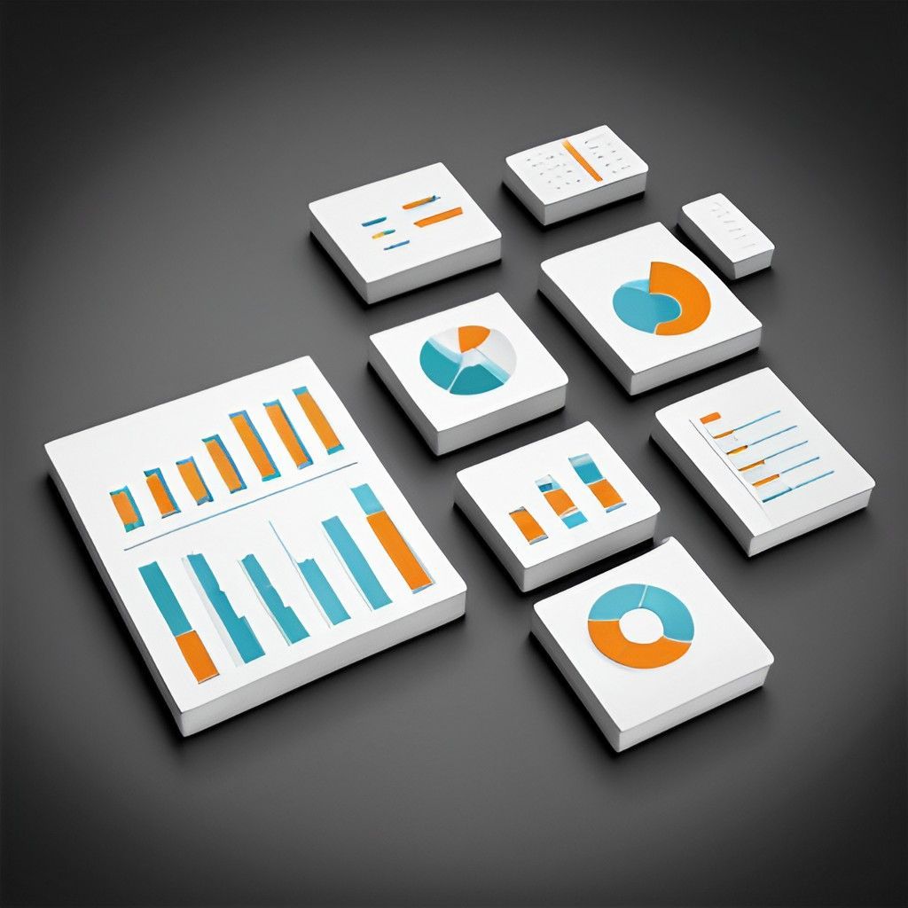
Data visualization encompasses several fundamental aspects crucial for effective data interpretation. It plays a pivotal role in various domains like data exploration, performance benchmarking, ROI analysis, and customer segmentation. Good data visualization should be accurate, accessible, and aesthetically pleasing, allowing users to grasp the essence of the data quickly. It's not just about presenting data; it's about telling a story that informs and persuades.
Illuminating Data Insights: Unveiling Patterns and Relationships Through Visualization
In the process of data exploration and discovery, data visualization is indispensable. It facilitates the identification of patterns, outliers, and insights within large datasets, which might be invisible in raw numerical forms. By visually representing data, you can uncover hidden relationships and trends that inform decision-making. This aspect of data visualization is particularly useful in fields like marketing, finance, and health care, where understanding complex data patterns is crucial.
Elevating Performance Benchmarking: Visual Clarity for Informed Decisions
Data visualization significantly enhances performance benchmarking. It simplifies the comparison and evaluation of various performance metrics across different departments, teams, or market competitors. Visual representations like bar graphs, line charts, and heat maps provide an immediate understanding of where things stand. This clarity is essential in settings where quick, data-driven decisions are necessary.
Navigating ROI with Clarity: Visualizing Financial Insights for Strategic Decision-Making
Analyzing return on investment (ROI) becomes more intuitive with data visualization. It's particularly effective in presenting financial data and investment returns and comparing the cost-effectiveness of different strategies. Visual tools can highlight ROI in a way that's immediate and understandable, helping guide strategic decisions. It's a powerful way to communicate financial performance and projections to stakeholders.
Sharper Strategies through Visual Customer Segmentation: Tailoring Success With Data Visualization
Customer segmentation is another area where data visualization shines. By visually segmenting customers based on behavior, preferences, or demographics, businesses can tailor their strategies more effectively. Visual tools can reveal patterns and trends in customer behavior, providing insights into how to better serve different segments. This leads to more targeted marketing, product development, and customer service strategies.
Enhancing Collaborative Information Sharing: Elevating Data Presentation
Effective information sharing is vital in today’s collaborative work environments, and data visualization plays a key role in this. Utilizing online tools to add pages to PDFs can further enhance the presentation and sharing of visual data. This capability ensures that comprehensive data reports are easily accessible and understandable to all relevant stakeholders. It's about making data not just visible but shareable and actionable.
Synergizing Machine Learning and Visualization: Unveiling Complex Insights for Industry Transformation
The integration of machine learning with data visualization opens up new frontiers for understanding complex systems and decision-making. Machine learning algorithms can analyze large datasets and uncover patterns that might be missed by the human eye. When these findings are visualized, they provide a deeper, more nuanced understanding of the data. This synergy between machine learning and visualization is transforming industries by offering more sophisticated insights.
This look at data visualization highlights how it simplifies complex data and helps us understand it better. It's not just about making data look good; it aids in discovering important information, analyzing returns on investments, and communicating effectively. When you use these visualization methods, you can improve your ability to analyze data, turning it into valuable insights for making smart decisions. As you deal with more and more data, let data visualization help you make sense of it all and turn confusion into clarity.
Written and submitted by Cody McBride of techdeck.info
News & Articles